- Đã chỉnh sửa
Spine v4 BETA - Feedback!

Hello Esoteric!
Thanks so much for releasing the closed beta 8)
I thought it was a good idea to have a thread where all the users put their feedback in, to have them all in one place, easy to check.
I wanna start with a couple of feedbacks:
1) scrolling the timeline
when scrolling the new graph editor and the old dopesheet by dragging the cursor on the timeline over the border of the panel, the speed is constant and seems to be relative to the number of frames/time, which is a bit annoying, cause I, as a user, have no control over it with my mouse, but only by zooming in or out the timeline. Maybe sometimes I want to move really slow through the timeline while keeping a close zoom, or viceversa.
I've noticed that the tree panel works differently, it starts slow and progressively increases its scrolling speed, to make me reach far points quicker.
This is a good approach and I've always loved it in Spine, but I'm wondering if there could be a even better approach:
The further I go with my cursor, the faster I scroll.

Do you think it makes sense?
If for any reason you think this approach is problematic, I would be fine also with the tree one, as long as I have one way to control my movement speed with the mouse.
I put it here cause I predict even a more intense timeline scrolling, given the new amazing graph editor.
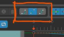
2) cannot set the curve type in the new graph editor
I can only do it in the dopesheet. I cannot even select a keyframe, clicking on it just gives no reaction, probably you guys already know it but I wanted to make sure you know.
I'm talking about these buttons:
Thanks again, I'm looking forward to animate with it!

- Why can't I select multiple keys in curve mode?
- Would be awesome to have X and Y axis keys separate
- The functionality of the dots in the attached screenshot are poorly understandable. Understood the meaning only after clicking on them for 10 minutes

It's a little premature for public discussion since not everyone has access to the v4 beta yet. For those who don't: we have a few users trying out the v4 beta so we can catch any problems before doing a release for everyone. We're just massaging a few things and will make the v4-beta public for everyone in a day or so.
Anyway, thanks for the feedback! This release was a whole lot of effort for us and we hope you all enjoy it. :cooldoge:
You currently can't select anything in the graph, you must use the dopesheet to select keys. We'll add graph selection along with separate X and Y keying soon-ish. Did you read the whole v4 beta page? :yuno: :p It's OK though, others are bound to bring up these same items.
The graph visibility dots seem pretty straightforward to me. They work similar to the tree or main toolbar dots. That they allow you to control which curves are visible should become apparent once you click them. What did you find confusing about them?
Re: scrolling when dragging past the view's edge, when you do this, usually it's because you ran out of room. You can drag outside the view and then not move the mouse and the view will continue to scroll. That is why the speed it moves isn't based on the mouse movement or distance
the mouse may not be moving and may not have much room, eg it could hit the edge of the screen.
The speed it uses to "auto scroll" in this case is the playback speed. That was chosen because the expectation is that scrubbing is used to see the poses over a few frames, so you probably scrub at the playback speed at most, usually slower. It could work by increasing the speed the longer the mouse is outside the view or by how far the mouse is outside the view, but it's maybe a bit odd to use scrubbing to scroll the view in the first place. Scrubbing is most useful when the portion of the timeline you are scrubbing is visible within the view.
Generally scrubbing (dragging on) the timeline is to see a few frames over time. Scrubbing past the edge of the view is pretty limited and not intended to be the primary way to scroll horizontally. I would scroll horizontally using the right mouse button to pan, just like in the viewport. Note you can now pan up/down with the right mouse button in the dopesheet.
We could keep it as is, but speed it up if the mouse is moved significantly past the edge of the view, but I still don't think it's a great way to pan. Can you explain why you prefer scrubbing to panning?
Also, why are you needing to scroll left/right so much? If you choose a graph-centric approach, turn on Sync in the graph and place the graph and dopesheet views above/below each other, then your timeline matches the graph. With that, the graph's auto frame means you rarely need to scroll left/right and you can use mousewheel scroll to pan/zoom the graph, just like the viewport, to get the keys you want to see in view. With Sync your dopesheet probably doesn't need to be very tall. Note you can click the settings button in the dopesheet view's titlebar and hide all the dopesheet toolbars to save vertical space.

I love the control of curves that is offered in the graph editor, however I feel that it should be something that is incorporated as an option in the dopesheet. Maybe a toggle to show or hide curves.
The graph and dopesheet were purposefully kept separate. Combining the two is less flexible, as you can't work with just one, or with both at the same time with different configurations. The Sync and hide toolbars options mentioned in my post above allow you to effectively combine the two views.
Nate đã viếtThe graph visibility dots seem pretty straightforward to me. They work similar to the tree or main toolbar dots. That they allow you to control which curves are visible should become apparent once you click them. What did you find confusing about them?
The dots near the bones or animation name seem to not respond, when you select only one bone. all makes sense when you have 2 or more bones selected.
In tree view whenever you hit the dot it triggers(hide/show), the dots for curves work more like focusing that timeline rather than showing/hiding that timeline. you never can make the dot disappear by clicking on it, which is not the case for other dots. but anyway right now it makes sense and it is very easy to use. Just tried to explain the confusion.
Ah, that makes sense. The dots don't let you have nothing selected. We'll see about hiding them when they aren't useful.

Hi all,
I've just tried the v4 Beta, had these in the assets, is this something that's related to the GPU? I put the antialias to 2x, but no changes at all, the assets is jagged and had white borders.
Let me know if this is related to the Beta version, or something with the GPU.
Any suggestion would be much appreciated.
Best regards,
Erick S.
@[đã xóa]
Thanks so much for your replies, yea I read the whole beta page but probably too quickly :facepalm2:
Anyway, I usually prefer scrubbing over panning cause of a few reasons, mainly deriving from the way I manhandle controls in Spine:
I scroll through my animation moving the cursor A LOT, it's one of my favourite feature in Spine, since it's so fast, reliable comfortable. I don't need to always check my animation by playing it, scrolling quickly makes me save time by looking at it super fast, for example when checking spacing, arcs, poses....
Moving along the whole animation when it's partially covered (zoom too close) would mean cover some other parts that I might need to check too, so what I always do is zoom out with my mouse wheel instead, to be able to check through all the animation (the ones that last a reasonably long animation time) always moving the cursor with my left button.
Even if I move from a part of animation to another one, I prefer the scrolling bar, I don't exactly know why, probably because of the meta info it gives me (I have a better idea at a glance about where I am in my whole animation interval) or probably because standard horizontal scrolling works like that. But this is a really rare case, I usually prefer to keep my whole anim on screen to avoid having to pan at all.
The introduction of a ful graph editor made me think that from now I'll be needing moving everywhere may more that before, and a way that I sometimes use to not having to let the cursor go is pushing it out of the edge to make the panel scrub. It just feels natural to me.
I know it's probably a weird thing of mine, and I also get the point of not having enough room out of the panel to appy the distance/speed relation. I still think the way the tree panel scrubs when I want to drag something through it is the best. It's your fault that made me discover that pleasure :lol:
So, since while scrubbing with the cursor I'm dragging the cursor around the timeline, I was expecting the same behaviour, and I thought it would not have made the thing worse for anybody (but on this point maybe I'm wrong and there's people who prefer a constant speed while scrubbing).
It's obvious that this is a super minor thing and I don't want to slow down other important bug fixes that you might have pending, but I felt like Spine really gave me a new standard in UI and usability, it's literally my benchmark for everything else, so I just want to keep it at the highest postion in my ranking :grinteeth:
Thanks for reading this wall of text, you guys are amazing.
@warmanw, I tried not showing the dots when they aren't useful. That is, when clicking them would hide everything, so Spine keeps them active. I'm not sure I like it though, as it loses some consistency to have the dots not there sometimes. It may just be something that takes some getting used to. The confusion only happens when the graph is showing one bone, especially when the one bone also has only one timeline. All other times clicking the dots toggles them.
@ericbdg, I'm not aware of that being a problem. Does it happen in 3.8? Do you have color management turn on in the settings? Can you send your project file and images so we can see the problem? contact@esotericsoftware.com
@Fabiano, thanks for the clarification. I think it should be relatively rare that you need to pan back and forth because you are zoomed in. Frame/auto frame in the graph keeps your curves in view. You may want to zoom in sometimes, but when finished at that zoom level it feels natural to auto frame or zoom out or pan, just like you do in the viewport. You probably don't want to remain zoomed in and pan at that zoom level, but if you do it still feels natural to me to zoom out and then in again at a new location, again like the viewport. Maybe try out the graph for a while and see if you still find yourself wanting to pan by scrubbing the timeline. If so, please let us know!
As you said, most animations can fit in the view, so will rarely scroll left/right. If you do have a very long animation then I think there is more of a case about needing to pan left/right because the curves may be too small to adjust comfortably when framed. I think panning is best done explicitly, eg by dragging the right mouse button. I'm still not sure about increasing the auto scroll speed when dragging the mouse from the timeline past the edge of the view. We may still do it, but the reason I don't like it much is that you have to drag, it starts auto scrolling at the playback speed, then it increases over time
that means you have to wait to get to the part of the animation you are looking for. I don't want to have to wait to get what I want, I want to be in control.
@Fabiano, we have some new hotkeys in v4 you might like:
Timeline Pan Drag:
Timeline Pan Move:
Timeline Frame Drag:
Timeline Frame Move:
These hotkeys should make you even faster! They allow you to pan or scrub wherever the mouse is, without needing to move your mouse to the timeline:
Timeline Panscrolls the dopesheet left/right.Timeline Framechanges the current frame (like scrubbing). This has the same behavior as dragging past the edge of the view though, we'll see about improving that. If it scrubs the timeline and scrolls the view at the same speed you move your mouse, maybe that is the best solution.Dragmeans you hold the hotkey and then press the left mouse button and drag the mouse.Movemeans you hold the hotkey and just move the mouse, without needing to press a mouse button.
Fabiano đã viếtI felt like Spine really gave me a new standard in UI and usability, it's literally my benchmark for everything else, so I just want to keep it at the highest postion in my ranking
Haha, great! I like discussing this sort of thing, as usability is important to us. As a developer, I'm not a real user so while I have a lot of experience with UI/UX, I'm not out there in the trenches suffering daily from some usability issue. Please don't hesitate to bring up even minor issues. Even a minor issue can be a real thorn in your side when encountered repeatedly. Also if you don't see us fixing something, don't be shy about bringing it up multiple times and explaining why you want it until we fully understand and get it done for you. 
In 4.0.02-beta we've improved the 4 hotkeys mentioned above. They are really convenient now!
Nate đã viếtAs a developer, I'm not a real user so while I have a lot of experience with UI/UX, ...
Please don't hesitate to bring up even minor issues. ...
Also if you don't see us fixing something, don't be shy about bringing it up multiple times
It is not related to v4 beta but since you are looking for even minor UI issue. I won't be shy and bring this up a 2nd time. 8)
Putting almost everything (bone tree, draw order, animation, skins, etc) under a single panel which cause viewing/selecting them at the same time not possible is not really a good decision. :sucks:
It maybe easier to do from programmer's perspective but from user or UI designer stand point, it is ... :smirk:
(No pressure, just a reminder that this issue exist whether it is in the todo list or not)

Hey all,
I've been testing 4.0.01 BETA and I have a request. I hope it is a simple one!
In the transform selection in the graph editor to the right of the names is a massive amount of blank and useless space (I am not talking about the dots, the dots are cool) If there was some option to prioritize the graph windows space over that blank space I would appreciate it a lot. Even if it crops the name of the rig, animation name and the controls I would be okay with that. Even a more minimalist option that just shows the transform icons would be a nice option too.
On another separate note. Is it possible to view the negative area on the left side of the graph? I can see that there is graph data beyond 0.
The graph editor feels nice to use so far. I haven't used 4.0.01 that much but so far the graph editor is what I always was dreaming about! It's wild that we can control the X and Y separately now!
@Nick, noted!
mikedssx đã viếtthere was some option to prioritize the graph windows space over that blank space I would appreciate it a lot.
The max width of the left space is based on the names of the bones and timelines. The reason you see it very large is that it grows larger but not smaller when the contents of the dopesheet or graph change. If it did, it would be a different size depending on what was selected and that would make the work area for the dopesheet keys or graph curves jump around, which is unpleasant to work with. However, if you lock the dopesheet or graph, then it will size to the items since when it is locked the size won't be changing.
mikedssx đã viếtEven if it crops the name of the rig, animation name and the controls I would be okay with that. Even a more minimalist option that just shows the transform icons would be a nice option too.
Cropping the names can be problematic, eg if names are the same except for a number at the end. Truncation where the ellipsis is in the middle of the name could be interesting, eg myreallyl...bonename3 instead of myreallylongbonena.... It could still be a problem, so would need to be a setting disabled by default.
mikedssx đã viếtIs it possible to view the negative area on the left side of the graph?
Yep, click the little arrow at the bottom of the graph under frame 0.
mikedssx đã viếtIt's wild that we can control the X and Y separately now!
Yes! Though so far they only have separate curves, they are still keyed together. We'll add separate keying during the beta. Also check out color curves, each of the RGBA channels has their own curve, though like translate are still keyed together.
Check out this video we just finished that goes over the graph features:
It has English subtitles so far and will have Chinese, Japanese, and Korean soon.
Nate đã viết@ericbdg, I'm not aware of that being a problem. Does it happen in 3.8? Do you have color management turn on in the settings? Can you send your project file and images so we can see the problem? contact@esotericsoftware.com
Ok, I've sent the files with both version. Please check.